Thursday, December 31, 2009

Winslow Homer


This is a watercolour not an oil painting, but it's a good example of a simple and pleasingly balanced composition in a square. The square format helps to create a sense of restfulness. Homer has made a strong punchy image through the use of a wide tonal range from black to white, but there is also lots of interesting subtlety in the sky and shadows for the eye to lose itself in.

Happy New Year!


Jeffrey Larson,
16 x 12 inches


Those inexperienced with tonal painting, would probably be afraid to use the very dark tones seen in the figures (the arms and shadows in the blond hair are almost black)  but they are critical to producing, through contrast, the effect of brilliant light reflecting off the foam.
It's a useful exercise to look at the different tones in an image in isolation from each other. You'll be surprisied, maybe even shocked, at how much darker or lighter the isolated tones really are compared to their appearance in the whole image. You can use a piece of opaque paper with a small hole in it, or, with digital images, use the eye-dropper tool in PhotoShop to sample tones and hues.

Tuesday, December 29, 2009

Kim English


I like the concise and energetic brushwork in this piece.

Sunday, December 27, 2009

John Singer Sargent - American


Low Tide at Cancale Harbour


The Derelict


Sargent has found an interesting viewpoint for the top painting. The arrow shape of the harbour wall is unusually dynamic, threatening to lead the eye out of the composition, but the other objects draw it back in.

In The Derelict, the placement of the ship on the right of the image intuitively feels right. The eye of the viewer tends to read a painting from left to right. Objects on the right give a sense of the passing of time and tranquility (which suits the subject - a derelict boat) whereas a single object on the left can evoke a more abrupt or violent mood.

Saturday, December 19, 2009

Winslow Homer - American


Watching the Breaker


Another example of strong tonal contrast producing a sense of drama appropriate to the subject of the work. White spray behind dark figures is a favourite device of seascape painters. The small area of dark rock on the left balances the dark on the right. Snow-covered rocks contribute to the contrast.

Sunday, December 13, 2009

Saturday, December 12, 2009

Ferdinand Keller - German


 Italian Landscape


This may be a marine scene, or the shore of a lake. Dark conifers provide a strong tonal contrast to the white clouds and foam.

William Ritschel - German American 1864-1949


Foaming Surf 26 x 30 inches

Tuesday, December 8, 2009

Newell Convers Wyeth - American


Robinson Crusoe
cover illustration, oil, 80 x 76.2 cm


The strong tonal contrast between the figure's dark coat and the white spray behind, increases impact.

Monday, December 7, 2009

Joaquin Sorolla - Spanish

Barcas en la Playa,
22 x 37 inches


The lively dance of Sorolla's brush gives  his paintings their spirit and energy. The only way to get this kind of confident fluency is to spend a lot of time painting. Sorolla seems to have been very prolific in his output.

Tuesday, December 1, 2009

Edward Moran


Off Calais Pier


 As a general principle, diagonal lines that lean in towards the centre of the image are considered better compositionally. Outward leaning lines tend to lead the eye out of the frame of the image, lessening its visual gravity. 
The lines of the mast, horizon, boat's wake, and the edge of the sail of the rear boat, converge on a group of figures, creating a focus of interest.

Thursday, November 26, 2009

Winslow Homer - American


The Gulf Stream


A good painting to look at if you think you are having a bad day.

Wednesday, November 25, 2009

Frederick Judd Waugh


At the Base of the Cliff, 1908, 
40 x 50 inches


Before attempting a seascape, it's always a good idea to consider what the painting will be about. If it's about the sea, devoting a large proportion of the composition to the sky or land, may detract from the subject, and weaken what the painting has to say. Other elements can contribute to the overall mood, and to the evocation of a place in time, but often, just a strip of sky and a fragment of cliff are enough. In this work by the master seascape painter, Frederick Judd Waugh, 90% of the image is nothing but water and foam, but there is still the impression of a specific place and time  -  the base of a cliff, perhaps at evening.

Sunday, November 22, 2009

Thomas Buttersworth


Men o War Running Before a Storm


A familiar device in nautical painting is the contrasting of the dark lines of the masts with an area of bright sky behind.

Saturday, November 21, 2009

John Whorf


Sailing
30 x 37 inches


Focussing on just the bow of the ship, cutting the waves, gives a sense of the drama of sailing, and the power of the sea. The lines of the ship and horizon converge on the group of figures, creating a centre of interest.

David James - Brtish


Incoming Tide, Sunset St Ives, 1895


Simplicity is power. A minimal composition consisting of a single breaker forming a white crescent at the centre of the image. This simplicity of composition is combined, however, with intricate and convincing detail.

Tuesday, November 17, 2009

Monday, November 16, 2009

Sunday, November 15, 2009

Arthur Grover Rider

Fishermans Cove, 1930, 30 x 34 inches

This is one of the few scenes in this blog with a cloudless blue sky (seascape painters often prefer cloudy skies, perhaps to avoid a cliched postcard image. But this work is such an interesting composition that it runs no risk of looking cliched). The yellow hues in the sand and foreground boat complement the blue. Long shadows suggest late afternoon, and a mood of tranquillity.


Thursday, November 12, 2009

Sargent and the Sea


The Corcoran Gallery of Art, in Washington DC, is currently showing an exhibition of seascapes and marine themed paintings by the famous American expatriate painter John Singer Sargent.

"The exhibition will place the sea on center­stage and highlight the impact it had on Sargent’s career, the development of his style, and his artistic preferences."

"While Sargent is best known for his society portraits, Sargent and the Sea will focus on his personal passion for the sea and his knowledge of seafaring."


En Route pour la peche (Setting out for Fishing)


Seascape

Wednesday, November 11, 2009

Ludolf Backhuysen


Christ in the Storm on the Sea of Galilee, 1695


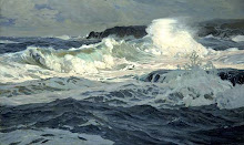
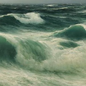
Don't be afraid to use black in a seascape; what better to bring out areas of white foam and spray. When choosing to use black oil colour, there are several variations of black pigment to choose from, just as there are different whites. 
Ivory Black is a deep velvety black that is cooler in mass tone, but warm in tint (slight brownish undertone). Lamp Black, a very old pigment dating back to prehistoric times, is also a deep, velvety black but has a bluish undertone. Mars Black is the strongest black and is warm in both mass tone and tint. Usually, for sea and sky, a cool, bluish black would be more suitable than a brownish black.
Many artists shy away from using black at all because it tends to "dirty" colour in mixing, and instead prefer to use a colour's complement to tint or shade. However, using black as a colour, you can avoid ‘dirtiness’ to some degree by taking note of the colour bias and tinting strength. This is where it becomes important to pay attention to the differences in different blacks and how to use them.
Many oil paint manufacturers also produce Indigo - a very dark blue - not as scary to use as black.

Tuesday, November 10, 2009

Lecomte du Nouy,


The Gaulish Coastguards,
76.5 x 126.5 cms


Another example of figure and seascape genres combined.

Sunday, November 8, 2009

Andrew Slatter - British


The swirls of foam have a wonderful abstract quality. A square format is often used to bring out the abstract element of an image. The speckled sand, and spray lifting off the breakers, may have been created by flicking the bristles of a brush loaded with oil paint diluted with turpentine or some other diluent.

Christopher Blossom


Westward Ho


The tonal contrast between the black hull of the ship and the bright area of sky on the horizon, is magic.

Friday, November 6, 2009

Wave Studies


Lake Superior


Seascape, 1935


These wave studies by Jeffrey Larson (top) and Norman Wilkinson (bottom) have a pleasing simplicity.

Jeffrey T Larson - American


Wading, 16 x 12 inches
Loose calligraphic strokes are perfect for capturing elusive reflections in the shallow water.

Wednesday, November 4, 2009

Henry Moore - English


Rough Weather in the Mediterranean


An area of dark tone in the lower right corner balances a light tone in the upper left. In both works the horizon is placed roughly at the golden mean position.


Steamer on the Far Horizon, 1873


Henry Moore is one of the finest maritime painters in the history of British art, but in most of his paintings, you have to look pretty hard to find the boat. The diminutive scale of the boats adds to the impression of the sea's vastness and power. As his obituarist in The Times wrote, in 1895: “His delight was in the sea itself and in atmosphere…” He was a master painter of waves - so much so that there is no need for other elements such as coastlines, clouds or clearly visible shipping.

Tuesday, November 3, 2009

Winslow Homer - American


Undertow
1886


Interesting combination of figure and seascape genres. The figures are at just the right scale in the painting so that neither genre dominates the other.

Monday, November 2, 2009

Arthur Suker - English

After the Storm,
64 x 128 cms

More Cliffs.
Air humidified by mist and spray increases the desaturation of tone with distance.

Cliffs


Joseph Berges,
Cliffs at Etretat,
1919

Stanley Cursiter, Blue Day, Yesnaby, 50 x 60 cms

The cliffs in the distance are lighter in tone because the intervening atmosphere desaturates the tones of objects as they recede into the distance. Warm colours (lower frequency wavelengths of light) are lost first, therefore high frequency blue light is all that remains from the most distant objects. The area taken up by flat seawater is relatively small in these compositions. The cliffs have much more visual and psychological weight that a flat plane of water; if they occupy only one half of the composition, it can look unbalanced.

Sunday, November 1, 2009

Ron Francis - Australian 1954 -

The Skateboard


This isn't a conventional marine painting, but I couldn't resist posting it - it's such an inventive image. Read more at: in the real art world.

Sunday, October 25, 2009

Alfred Lys Baldry


Rocks at Adgwith,
Cornwall,
Pastel
25.3 x 28 cms