Sunday, January 30, 2011

Painting Nature's Moods


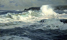
Grey Surf under Summer Storm, 24 x 30 inches, © 2010 Katherine Kean. Used with permission.

The American artist Katherine Kean paints the sublime and mysterious moods of nature with a fine touch. 
On her blog she mentions that  she uses cadmium orange mixed with ultramarine blue (complementary opposite color) and a little alizarin to produce a rich and interesting near-black color. 

See more of Katherine's work at her website: www.katherinekean.com

Wednesday, January 26, 2011

George Wesley Bellows

Comber c. 1913


Bellows studied under Robert Henri, at the New York School of Art, and became one of the Ashcan School artists, known for their gritty realism, and modernist desire for truth to materials. Reacting to the softness of American Impressionism they often chose dark, muddy tones. Not only was their choice of subjects realist, they wanted the paint, and the application of paint on canvas, to be free of illusionistic effects.
Robert Henri "wanted art to be akin to journalism. He wanted paint to be as real as mud..."
Like other members of the Ashcan school, Bellows worked as a commercial artist, which would have produced his rapid style and eye for strong images.

Saturday, January 22, 2011

Ludolf Backhuysen


Ludolf Bakhuizen (or Backhuysen) (1630 – 1708) was a German-born Dutch Golden Age painter who was the leading Dutch painter of maritime subjects after the two Willem van de Veldes (father and son) left for England in 1672.
Backhuizen specialized in scenes of ships caught in storms, exploiting the dramatic tonal contrasts of white sails and spray against dark clouds and deep wave troughs. He is said to have risked his life while venturing out into stormy seas to observe the forces of nature. The clouds in these works are wonderful, and just as important as the waves.

Saturday, January 15, 2011

Painting on Silver

This square painting by the American artist Katherine B Young, is one of a series painted on silver leaf. I imagine this would give a wonderful reflective quality for waterscapes. The oil paint layer would have to be transparent enough to reveal the silver underneath, requiring the use of a glazing medium. This is a largish piece (36 x 36 inches).


Point Lobos Surf, 24 x 30 inches
Artist's website

Friday, January 14, 2011

Zen Sand


Through it's encounter with Japanese art, in the late nineteenth century, the western seascape began to exhibit characteristics of Zen-inspired painting: simplicity, empty space and quiet, subdued tones.  Norwegian/Danish painter Peder Krøyer captured the luminous emptiness of sandy expanses at Skagen, Denmark, where a community of Danish and Nordic artists gathered, especially during the final decades of the 19th century. Krøyer was the unofficial leader of the group.

A Zen contemplative mood persists in contemporary marines such as this work by the Australian painter Peter Churcher (lower image).

Friday, January 7, 2011

Boldness


Paul Hampden Dougherty (September 6, 1877 – January 9, 1947) was one of America's most important marine painters. He was elected to membership of the prestigious National Academy of Design and was one of the most honored painters of his era. Often compared to Winslow Homer, Dougherty (pronounced dog-er-tee) became internationally recognized for his American Impressionism paintings of the coasts of Maine and Cornwall in the years after the turn of the 20th Century. His work has been described as bold and masculine and his artistic production consisted of many paintings of breakers crashing against rocky coasts and mountain landscapes, but he was more versatile than many viewers realized. Dougherty painted still lifes, created prints and even sculpted.
The son of a prominent attorney, Paul Dougherty graduated from law school and passed the bar, but chose art over the law. His artistic training was relatively brief but through natural talent and a prodigious work ethic, he quickly came to prominence. A sophisticated and erudite man and a world traveler, Dougherty sketched and exhibited extensively on both the east and west coast of the United States, in the British Isles, throughout Europe and in Asia. He spent the first half of his career based in the east, but he moved west in 1928 and eventually spent the summers in Carmel and the cooler winter months in the desert. Dougherty won almost every major award at the annual exhibitions of the National Academy of Design in New York as well as a Gold Medal at the Panama-Pacific International Exposition in San Francisco. By 1915 many American museums had purchased his works for their permanent collections.


Boldness and rigour is not simply a matter of energetic, decisive brushstrokes but comes through in clarity of composition and design.


Saturday, January 1, 2011

Pattern


Stephen Strickland is based in the Southern US.

Top: Boarder's Beach
Bottom: Packing Up 2, 30 x 30 inches


The visual possibilities of figurative representations repeated over and over to make texture and the puzzle-like effects of positive and negative shapes are significant to me. This configuration made from an aerial view gives me the freedom to see the abstract, two dimensional arrangement of parts to a whole.
- From the artist's website